Building the foundation for
Enterprise Experience Ecosystem


Nitrogen is Figma-based Enterprise's core design system & Component Library
A unified set of design principles, components, and guidelines that ensures every digital product we create is consistent, accessible, and scalable. It acts as the foundation for building seamless experiences across teams, products, and platforms.
Best-in-class Design System for Enterprise Applications
Scope of the system
Foundations, accessibility tokens, components, interaction states, theming, and governance
Primary Objective
Create a single, inclusive source of truth that scales safely across teams
Built on Figma's Latest Design Standards
Variables, modes, component properties, and nested components — to create a future-ready design foundation.
Standardised Design Tokens
Creates a unified visual language that eliminates inconsistencies across internal applications.
Modern, Modular & Distinctly Enterprise
Designed with a clean, contemporary visual language that reflects a modern enterprise while remaining purpose-built for complex workflows.
Accessibility
Built-In
Accessibility is embedded into every token, component, and pattern from the start.
Discover
Understanding the business context, mapping the fragmented landscape, and defining the real cost of building without a shared foundation.
Business Context
One organisation. Hundreds of disconnected tools.
In 2023, the organisation underwent one of its most significant transformations in recent years — bringing together all entities under a single, unified business structure. The goal was ambitious: one connected organisation capable of delivering seamless experiences for customers, employees, and partners across the entire ecosystem.
With that new structure came an immediate challenge. Hundreds of internal applications across HR, Finance, Legal, and Corporate Affairs had each been designed and developed independently over the years. They varied in design language, usability standards, and technical implementation — built by different teams, at different times, for different purposes.
Multiple tools with inconsistent interfaces, creating friction for employees who move between systems daily
Duplicated work across teams solving the same UI problems independently, with no shared reference
New initiatives faced long setup times before a single screen could be designed or built
The Problem
Silos at scale
Multiple departments were building applications in isolation. Without a shared foundation, every team reinvented the same patterns — and each reinvention introduced new inconsistencies. The compounding effect was felt across the entire organisation.
- Inconsistent UI components and patterns across HR, Finance, and Legal systems
- High cost of maintaining redundant UI solutions with no consolidation path
- Difficulty onboarding teams quickly due to lack of documentation or a shared visual language
- Limited scalability — every new product started from scratch
The Solution
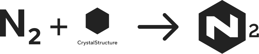
N₂ — an elemental framework
The realisation gave birth to N₂ (Nitrogen) — an elemental framework designed to standardise, accelerate, and elevate how the organisation builds its internal tools and experiences. Just as nitrogen is the invisible foundation that sustains life, N₂ would be the invisible foundation that sustains every product team.
A single design system providing reusable components, design tokens, and accessibility guidelines — one source of truth for every team.
Designed with enterprise use cases in mind — scalable, secure, and adaptive to the varied demands of internal tools across departments.
Teams stop solving the same problems independently. Shared patterns mean faster delivery, fewer decisions, and more time spent on product thinking.
Research & Discovery
Mapping the landscape
Interface audit: I led a team of two designers through a four-week audit across all products — cataloguing every unique UI pattern, component, and visual treatment. We documented everything in a shared Figma file organised by pattern type. The numbers confirmed what teams already felt: the same problems had been solved dozens of times, in dozens of different ways.
Developer collaboration: I paired with the principal engineer early to understand the technical landscape. The front-end was a mix of React and Angular, with some legacy implementations. Auditing the existing CSS confirmed that a token-based approach wasn't optional — it was the only path to sustainable consistency at this scale.
Define
Setting goals, establishing principles, and making the strategic decisions that would shape the entire system.
The Name
Why Nitrogen?
Nitrogen is one of nature's most essential elements — lightweight, abundant, and life-sustaining. Found everywhere, yet invisible, it quietly supports growth and function.
In the same way, the Nitrogen Design System (N₂) provides a lightweight, ever-present foundation that supports every product experience across the organization. Like nitrogen's role in sustaining life, N₂ powers innovation by staying in the background — simple, stable, and vital.
Goals
Defining what success looks like
Before designing a single component, we needed alignment on what the system should accomplish. I facilitated workshops with design leadership, engineering leads, and product managers to define clear success criteria.
One place for all UI patterns, components, and design decisions — no more tribal knowledge.
WCAG 2.1 AA compliance as a baseline. Every component ships with accessibility built in, not bolted on.
Reduce front-end development time for new features by eliminating redundant UI work across teams.
Strategy
Scoping the system
Phased rollout: We couldn't build everything at once, and we couldn't ask 12 teams to migrate simultaneously. I proposed a three-phase approach based on impact and dependency:
Design tokens, color system, typography, spacing, grid, elevation. Plus 8 core components: Button, Input, Select, Checkbox, Radio, Toggle, Badge, Tooltip.
Complex components: Modal, Drawer, Table, Tabs, Navigation, Card, Dropdown, Toast. Layout patterns and page templates.
Domain-specific patterns, data visualization components, migration tooling, and governance automation.
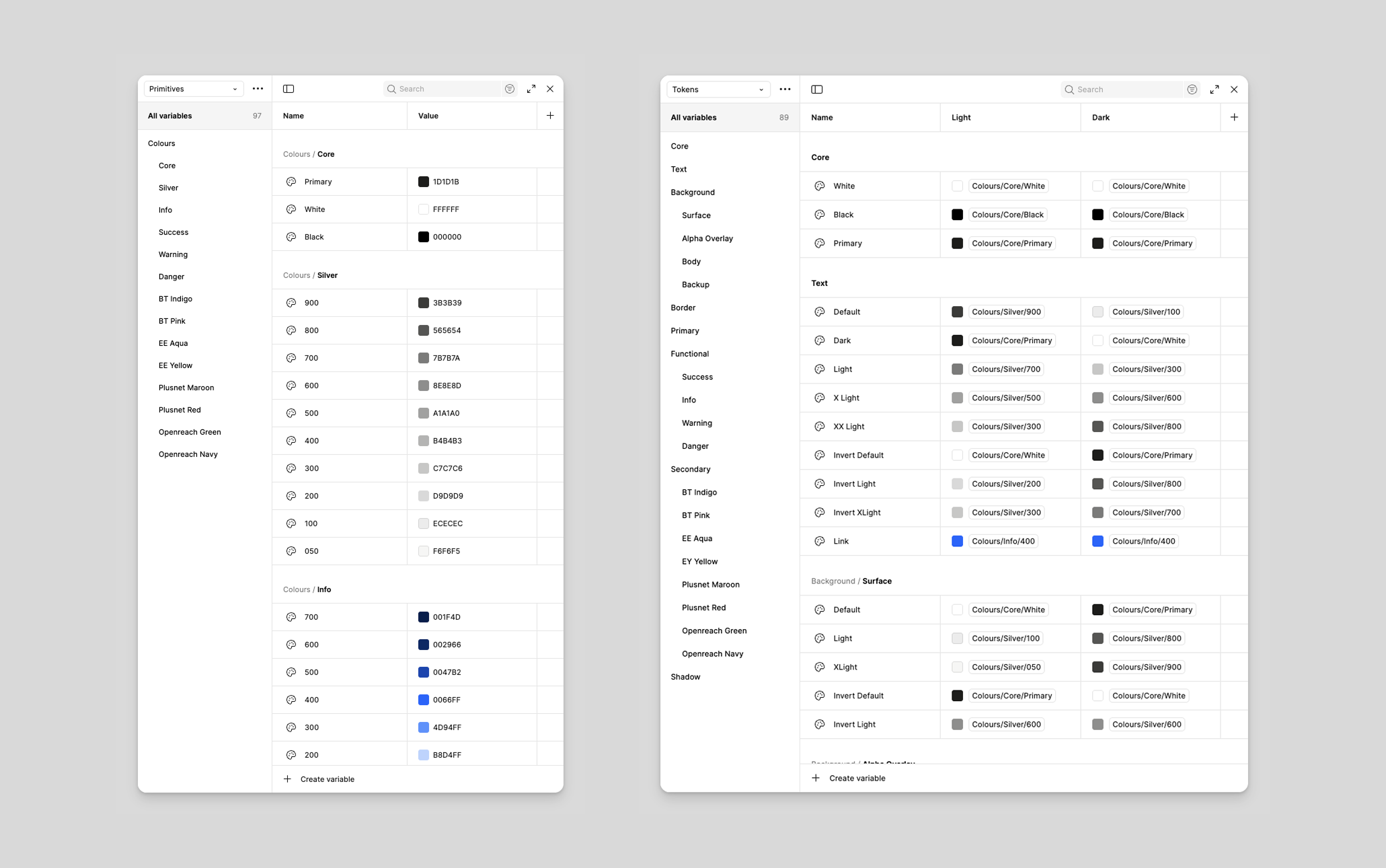
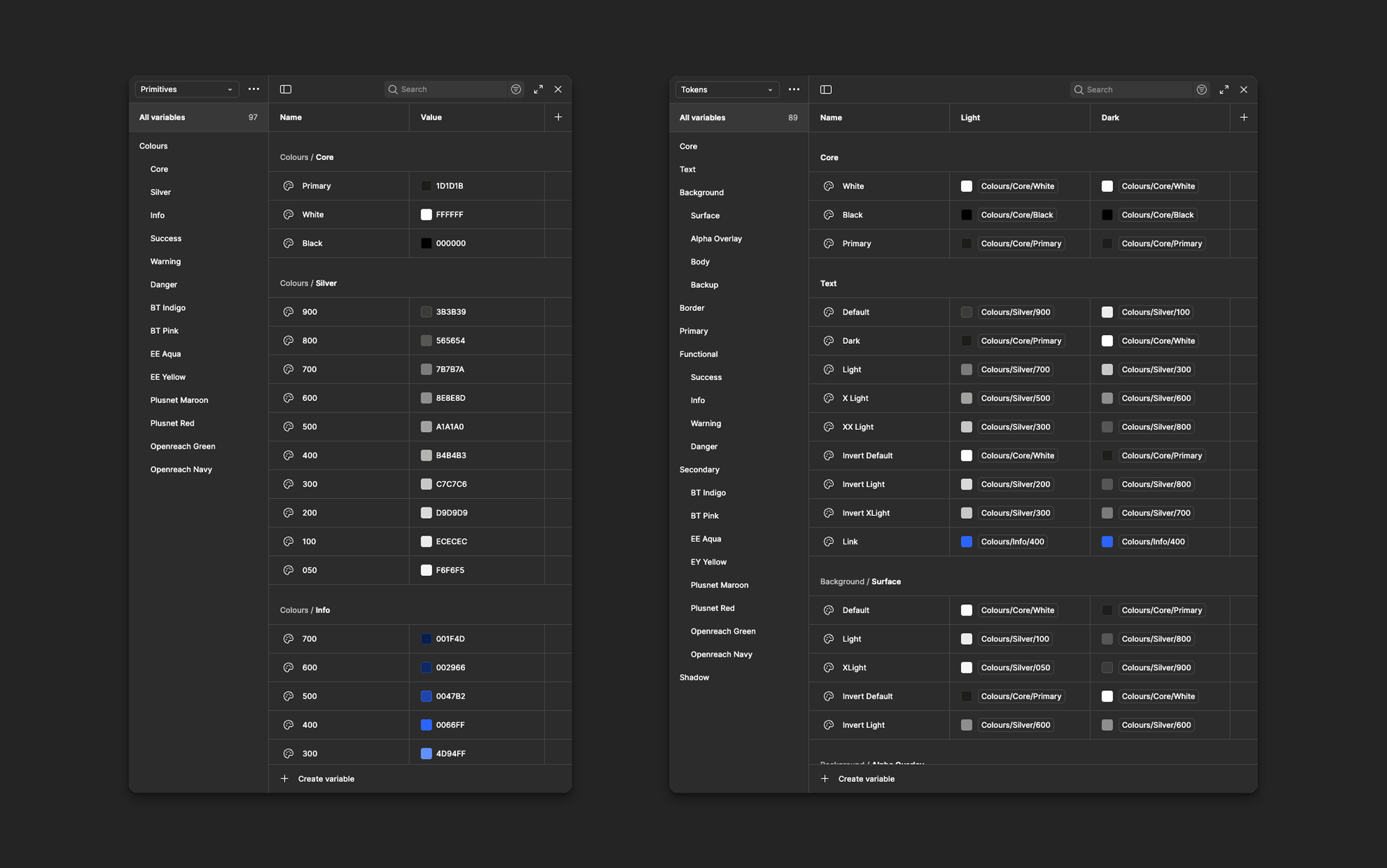
Token strategy: We implemented a three-tier token architecture that separated raw values from semantic meaning from component-specific usage:
| Layer | Example | Purpose |
|---|---|---|
| Global | --blue-600 |
Raw palette values. Never used directly in components. |
| Semantic | --color-action-primary |
Contextual meaning. Used in component specs. |
| Component | --button-bg-primary |
Component-specific overrides. Used sparingly. |
Governance model: A design system without governance is just a suggestion. We established a lightweight model: a core team of 3 designers and 4 engineers owned the system full-time, each product team nominated a "system ambassador" who attended monthly syncs, and new component requests went through a lightweight proposal process.
Design principles
The framework behind every decision
Every component should be immediately understandable. If a pattern requires explanation, it's too complex.
Teams need flexibility within guardrails. The system provides structure, not constraints.
Accessibility isn't a feature — it's a baseline. Every component ships with WCAG AA compliance built in.
Primary user
Who we were designing for
Design-to-engineering flow


The File Structure
Organising the N₂ Figma workspace for scale
To ensure scalability, collaboration, and a consistent design workflow, I structured the N₂ Figma workspace into four core folders. Each folder serves a specific purpose in supporting the design system, improving team efficiency, and maintaining long-term design governance.
All foundational design system libraries used across the ecosystem — color tokens, web and mobile typography, web components, and mobile components. Centralising these assets gives the team a unified visual language with effortless component reuse.
Supporting assets that complement the design system — icon sets, image collections, illustrations, and logo library. These ensure visual consistency and give designers easy access to brand-aligned materials.
Design governance and workflow standards — design guidelines, file-naming conventions, cover image libraries, and documentation for how designers should organise and maintain files. Every file stays structured, readable, and aligned with the broader system.
A safe space for exploration and experimentation. Designers prototype ideas, test components, and validate patterns here. Once a component matures and meets system standards, it is promoted to the Libraries folder as part of the official design system.
Design System Maturity Model
A three-stage strategic roadmap moving from atomic styles to a fully governed product ecosystem.
Foundations
Establishing the "DNA" of the system through technical specifications and inclusive standards.
- Design Tokens: Primitive & Semantic variables.
- Accessibility DNA: WCAG 2.2 contrast defaults.
- Atomic Logic: Grid and typographic scales.
Scale
Expanding into high-logic component libraries that automate consistency across products.
- Modular Components: Patterns with built-in logic.
- Prototyping Logic: Advanced Figma variables.
- Handoff Sync: ARIA and CSS role alignment.
Governance
Managing the system lifecycle through documentation and strict quality control.
- Compliance: Ongoing WCAG 2.2 AA audits.
- Contribution: Defined component request paths.
- Integrity: Strict versioning to prevent drift.
Constructing the Design file
A structured approach to building a scalable and well-organized design file, ensuring clarity and consistency, across teams.


Design
Building the foundations, components, and Figma library — and getting 12 teams to actually use them.
Foundations
Building the bedrock
Colour system
We built the colour system around perceptual uniformity using the OKLCH colour space, then mapped values to semantic tokens. Semantic colour palettes define functional roles and ensure consistent, accessible UI states across all experiences.
Less is more
Instead of dozens of near-identical shades, N₂ relies on a small, intentional set of primitive colours that power both Light and Dark themes. This keeps the palette easy to maintain, reduces cognitive load, and gives developers a predictable mapping.

One set of primitives, two themes
Light and Dark mode share the same primitives. Theme switching happens through semantic token mapping — token inversion — so both modes feel like two expressions of the same visual system, not separate styles.
Raw, brand-agnostic colours — neutrals, base hues, status colours, tints/shades, extended palette. Never used directly in UI.
Semantic colours used by components — surface, text, border, status — defined for both Light and Dark modes.
Why this structure works
- Flexibility for new themes or rebrands
- Resilience when primitives change
- Clarity through meaning-based selection (not hex codes)
- Scalability across teams and products
Typography
We adopted Inter as the primary typeface — optimized for screen readability with excellent language support. We defined a modular scale with a 1.2 ratio, producing 7 text sizes from 12px to 36px, each mapped to a semantic role with predefined line-height and letter-spacing values. This eliminated the 47 different font-size declarations in the existing codebase.
Spacing & Grid
A 4px base unit with a geometric scale: 4, 8, 12, 16, 20, 24, 32, 40, 48, 64, 80, 96. The layout grid uses a 12-column system with responsive breakpoints at 640, 768, 1024, 1280, and 1536px. Column gutters scale with the breakpoint.
Elevation & Motion
Five elevation levels correspond to spatial relationships in the interface — from base surface to toasts and notifications. Motion follows three principles: purposeful, efficient (150ms micro-interactions, 300ms layout changes), and accessible (respects prefers-reduced-motion).
Components
Designing for every context
Component anatomy
Every component follows a consistent internal structure: a root container, optional leading/trailing slots for icons or actions, a content area, and a label/description pair where applicable. This slot-based architecture gives teams flexibility to compose components without breaking the visual system.
Variants
A Button, for example, has: intent (primary, secondary, tertiary, danger), size (sm/md/lg), state (default, hover, active, focus, disabled, loading), and content (label only, icon only, icon + label). Each combination is explicitly designed and tested — not generated.
Accessibility
- Semantic HTML with appropriate ARIA attributes
- Keyboard navigation following WAI-ARIA Authoring Practices
- Focus management for complex components (modals, dropdowns)
- Color contrast ratios meeting WCAG 2.1 AA (4.5:1 text, 3:1 UI elements)
- Touch targets minimum 44×44px on mobile
Engineering
Closing the design-code gap
Handoff process
We replaced the traditional "throw it over the wall" handoff with a collaborative build process. For each component, a designer and engineer paired from the start. Specs were delivered as annotated Figma frames with token references — not pixel values. An engineer never needed to measure spacing or eyedrop colors.
Tokens pipeline
Tokens were authored in JSON, stored in a dedicated Git repository, and transformed using Style Dictionary into CSS custom properties, SCSS variables, JavaScript constants, and iOS/Android values. A CI pipeline validated token changes and published updates to the internal package registry.
zeroheight & versioning
Every component had a zeroheight page with axe-core accessibility testing and Chromatic visual regression testing integrated into the workflow. The system followed semantic versioning — patch releases weekly, minor releases monthly, major releases quarterly with migration guides.
Adoption
Getting teams to actually use it
Migration strategy
We didn't mandate a big-bang migration. We identified two "lighthouse" teams starting new features who were willing to build on the system from day one. Their success stories became the proof points that convinced other teams. For existing products, we provided a migration toolkit: a codemod for token replacement, a Figma plugin for component swapping, and a prioritized migration checklist.
Education
- Onboarding sessions — 2-hour workshops for new team members
- Office hours — weekly drop-in sessions for questions and implementation help
- Deep dives — monthly sessions on accessibility, tokens, and complex composition
Ambassador program
Each team nominated a "system ambassador" who attended monthly syncs and served as the first point of contact for system questions. This distributed model meant the core team didn't become a bottleneck — knowledge spread organically through the organization.
Outcomes
Building the system was the easier part. Adoption required relationship building, patience, and a willingness to meet teams where they were.
Impact
Measuring what matters
After 14 months, the results were clear — not just in metrics, but in how teams talked about their work. Design reviews focused on product decisions instead of debating button styles.
Key Learnings
What I'd carry forward
Start with tokens, not components
If I were starting over, I'd spend even more time on the token architecture upfront. We had to restructure our semantic token layer at month 6 because our initial naming didn't scale to theming — a problem we could have anticipated with more upfront research.
Adoption is a product problem
The biggest risk to any design system isn't technical — it's organizational. Teams won't adopt a system just because it exists. Treat adoption like a product launch: understand your users, solve their real problems, and make the migration path as frictionless as possible.
Documentation is the product
A component without documentation is a component that won't be used correctly. After we made documentation a required part of the component delivery process, adoption quality improved dramatically.
Governance needs to be lightweight
Our initial governance process was too heavy. We streamlined it after month 8, moving to a lighter proposal format and faster async reviews. Governance should enable contribution, not discourage it.
"A design system is never finished. It's a living product that evolves with the organization it serves. The goal isn't perfection — it's providing a reliable foundation that lets product teams focus on solving user problems instead of reinventing interface patterns."
Have a Design System Project?
If you're building or scaling a design system, I'd love to collaborate. Let's work together to create consistent, accessible, and impactful digital experiences.