
Building the foundation for
Enterprise Experience Ecosystem
Nitrogen is the enterprise's core design system & component library
A unified set of design principles, components, and guidelines that ensures every digital product we create is consistent, accessible, and scalable — the foundation for building seamless experiences across 12 teams, 100+ products, and 85,000 employees.
Best-in-class Design System for Enterprise Applications
Scope of the system
Foundations, accessibility tokens, components, interaction states, theming, and governance
Primary Objective
Create a single, inclusive source of truth that scales safely across teams
Built on Figma's Latest Standards
Variables, modes, component properties, and nested components — future-ready from day one.
Standardised Design Tokens
A unified visual language eliminating inconsistencies across internal applications.
Modern, Modular & Enterprise
Clean visual language purpose-built for complex workflows and dense information displays.
Accessibility Built-In
WCAG 2.1 AA compliance embedded into every token, component, and pattern from the start.
The Problem
One organisation. Hundreds of disconnected tools. Zero shared standards.
Context
Silos at enterprise scale
In 2023, the organisation unified all entities under a single business structure. With that came the challenge: hundreds of internal applications across HR, Finance, Legal, and Corporate Affairs — each designed independently, with different visual languages, usability standards, and technical implementations.
The Solution
N₂ — an elemental framework
N₂ (Nitrogen) — an elemental framework to standardise, accelerate, and elevate how the organisation builds internal experiences. Named after nature's most essential invisible element: lightweight, abundant, and life-sustaining.
One source of truth — reusable components, design tokens, and accessibility guidelines for every team.
Scalable, secure, and adaptive to the varied demands of internal tools across departments.
Shared patterns mean faster delivery, fewer decisions, and more time on product thinking.
My Approach
Strategic decisions, phased delivery, and design principles that shaped the entire system.
Design principles
The framework behind every decision
Every component should be immediately understandable. If a pattern requires explanation, it's too complex.
Teams need flexibility within guardrails. The system provides structure, not constraints.
Accessibility isn't a feature — it's a baseline. Every component ships with WCAG AA compliance built in.
Phased Rollout
Impact-driven delivery
Design tokens, colour system, typography, spacing, grid, elevation. Plus 8 core components: Button, Input, Select, Checkbox, Radio, Toggle, Badge, Tooltip.
Complex components: Modal, Drawer, Table, Tabs, Navigation, Card, Dropdown, Toast. Layout patterns and page templates.
Domain-specific patterns, data visualisation, migration tooling, and governance automation.
Token Architecture
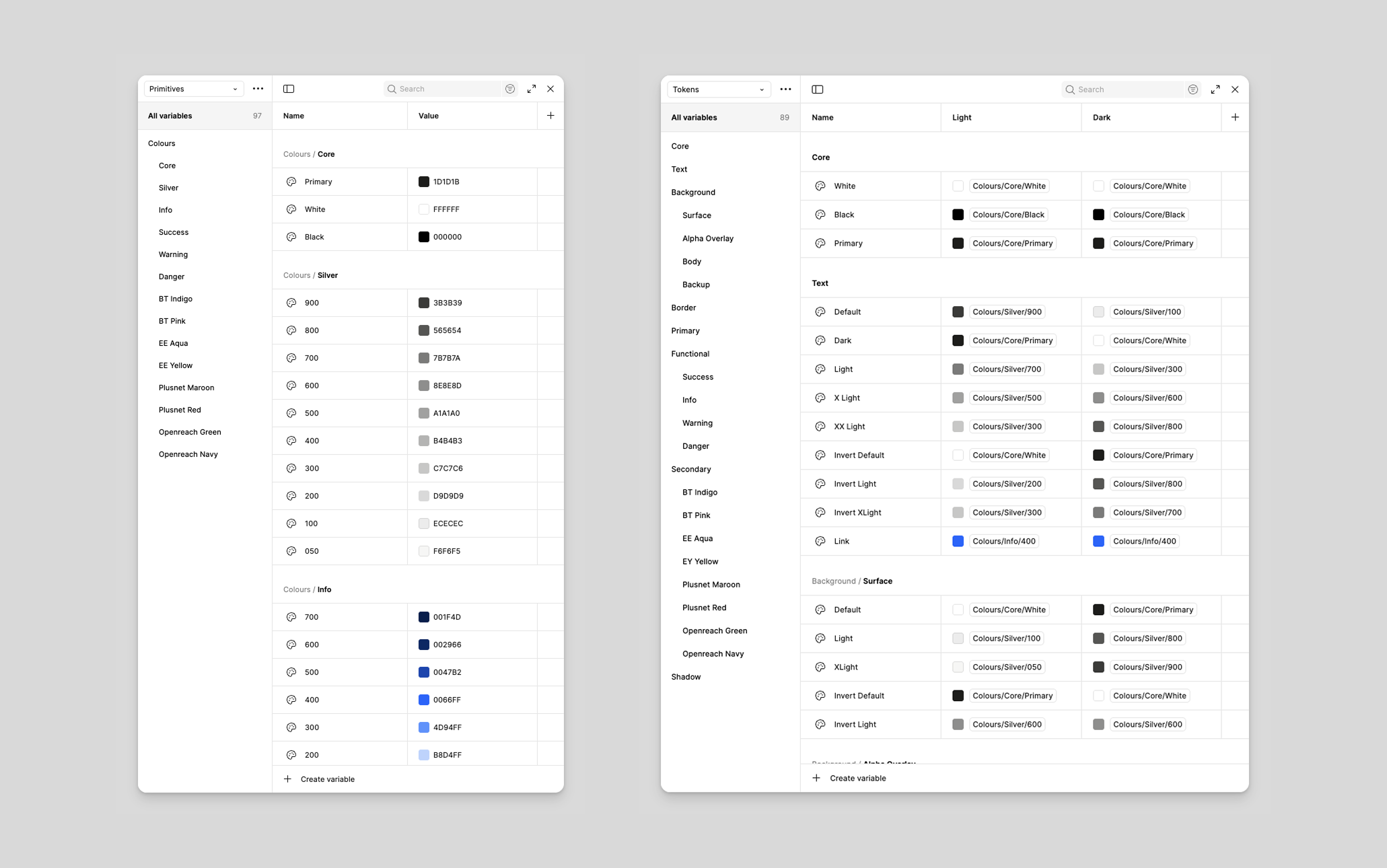
Two-tier system for scale
| Layer | Example | Purpose |
|---|---|---|
| Global | --blue-600 |
Raw palette values. Never used directly in components. |
| Semantic | --color-action-primary |
Contextual meaning. Used in component specs. |
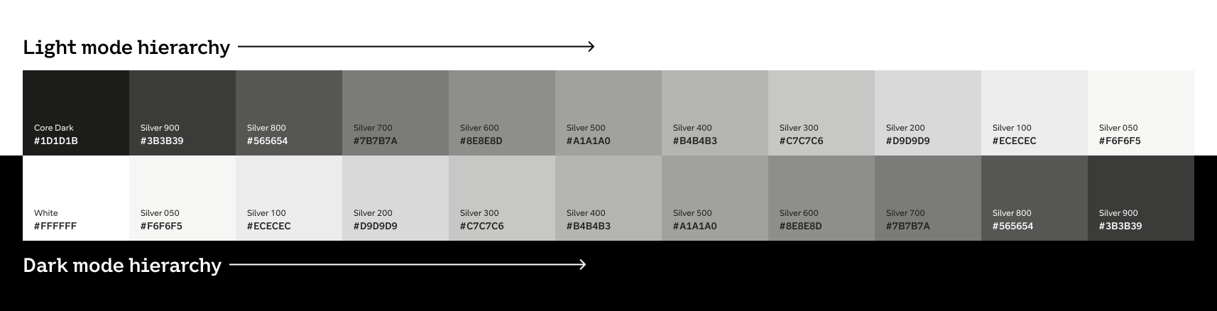
Light and Dark mode share the same primitives. Theme switching happens through semantic token inversion — both modes are expressions of the same visual system, not separate stylesheets.
Design
Colour, typography, components, and the Figma library — built for 12 teams to use from day one.
Foundations
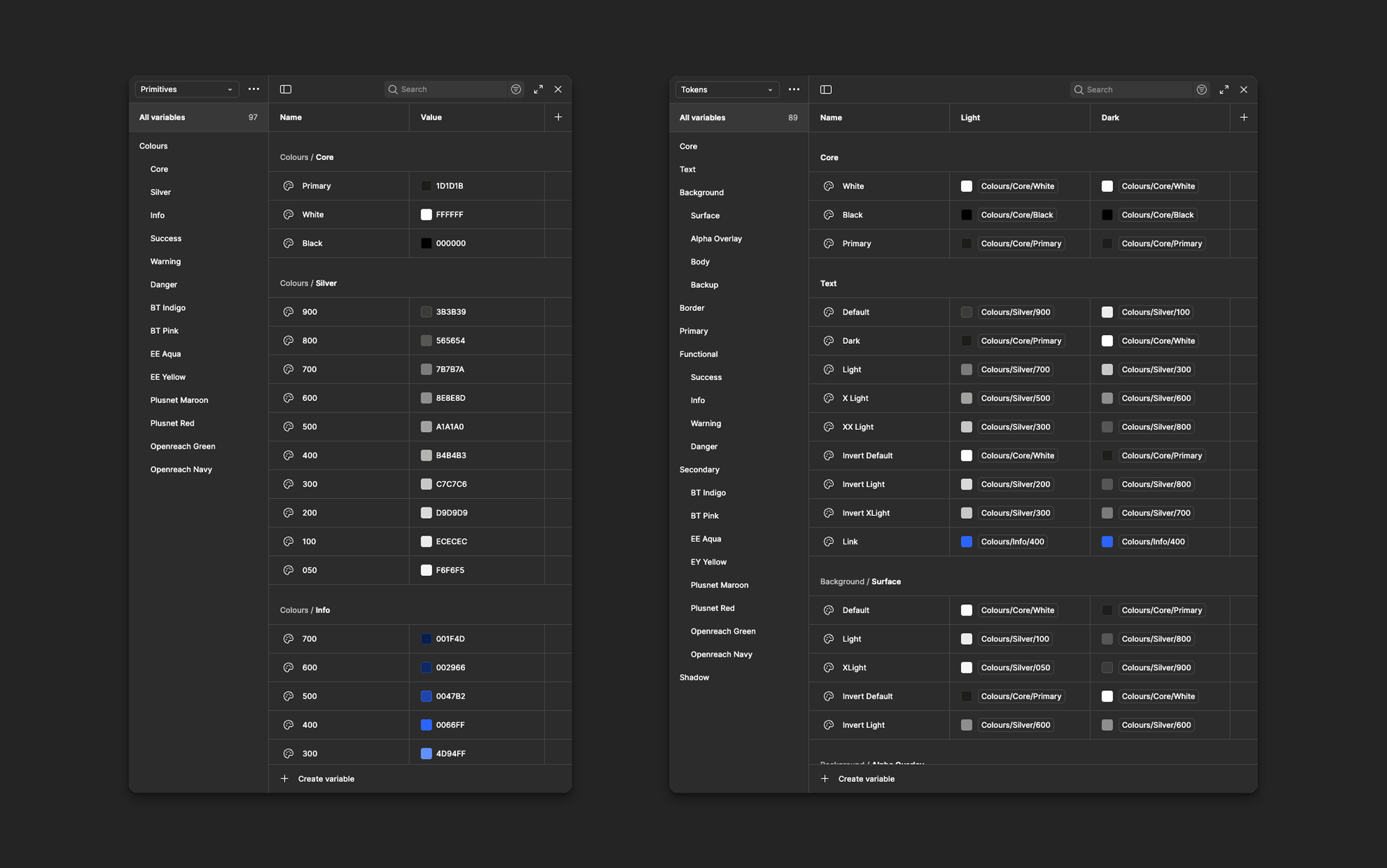
Colour, type, spacing, elevation
Colour system built on OKLCH for perceptual uniformity, mapped to semantic tokens. Inter as primary typeface with a 1.2 modular scale (7 sizes). 4px base spacing unit. Five elevation levels. Motion respects prefers-reduced-motion.
Components
Slot-based, fully accessible
Every component uses a consistent slot-based architecture: root container, leading/trailing slots, content area, and label/description pair. Variants are explicitly designed and tested — not generated. WCAG AA accessibility (contrast, keyboard nav, ARIA, focus management) is built into every component.
Adoption
Earning trust, not mandating compliance
We identified two "lighthouse" teams building new features who adopted the system from day one. Their success stories became the proof points for everyone else. For existing products, we provided migration tooling: a codemod for token replacement, a Figma plugin for component swapping, and a prioritised migration checklist.
Each team nominated a "system ambassador" for monthly syncs. Weekly office hours. 2-hour onboarding workshops. Knowledge spread organically — the core team never became a bottleneck.
Outcomes
After 14 months, design reviews focused on product decisions instead of debating button styles.
Impact
Measurable results
Key Learnings
What I'd carry forward
Start with tokens, not components
We had to restructure our semantic token layer at month 6 because naming didn't scale to theming. More upfront research on the token architecture would have saved weeks.
Adoption is a product problem
Teams won't adopt a system just because it exists. Treat adoption like a product launch: understand your users, solve their real problems, and make migration frictionless.
Documentation is the product
A component without documentation won't be used correctly. Making docs a required delivery step improved adoption quality dramatically.
Governance needs to be lightweight
Our initial process was too heavy. We streamlined after month 8 — lighter proposals, faster async reviews. Governance should enable contribution, not discourage it.
"A design system is never finished. It's a living product that evolves with the organization it serves. The goal isn't perfection — it's providing a reliable foundation that lets product teams focus on solving user problems instead of reinventing interface patterns."
Have a Design System Project?
If you're building or scaling a design system, I'd love to collaborate. Let's create consistent, accessible, and impactful digital experiences together.