
Cephalopod Logo Mark
Identity mark for an enterprise conversational AI platform
- Logo Design
- Symbol Exploration
- Motion Mark
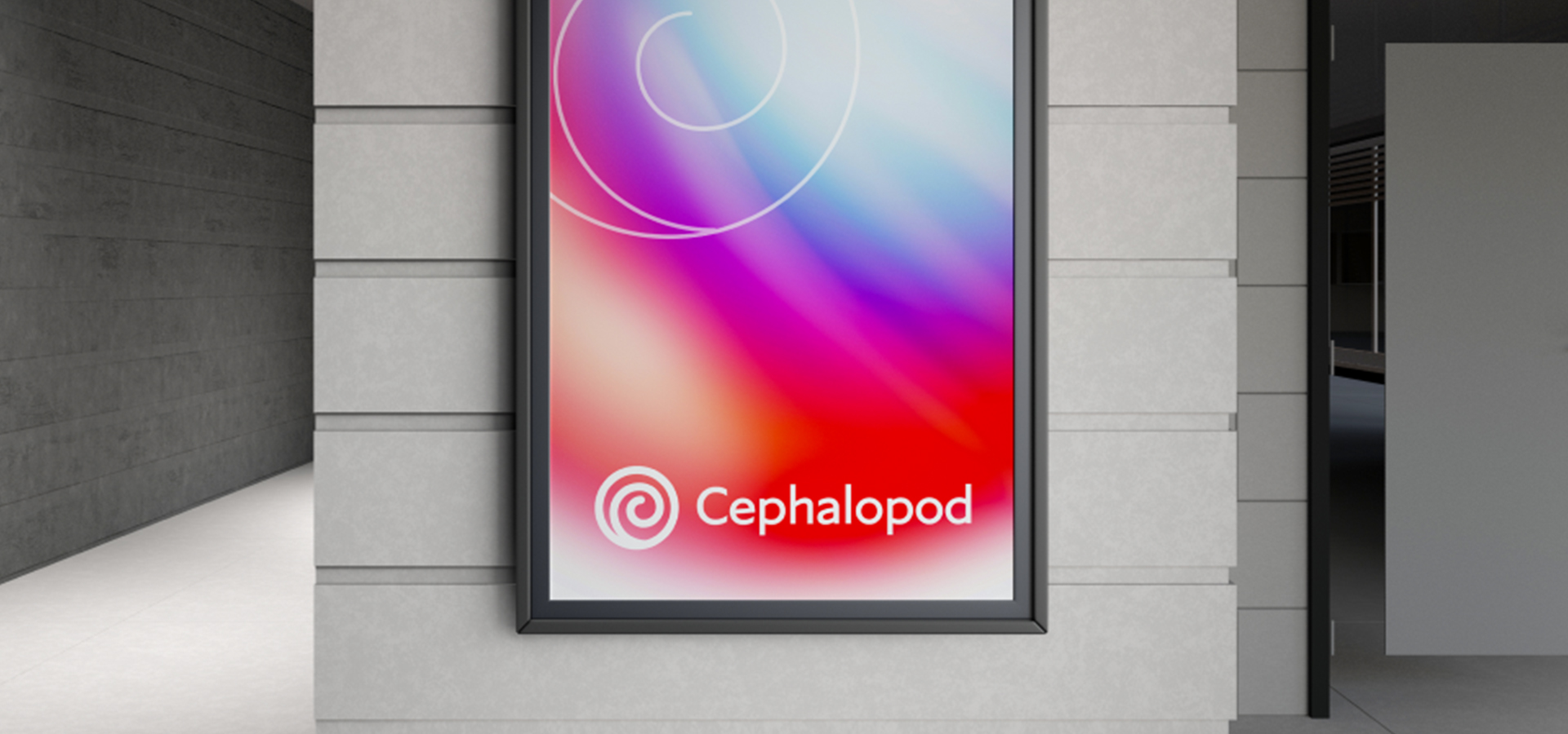
Cephalopod needed a distinctive logo mark that could live within BT Group's existing brand system — inheriting its colours and typography while establishing its own visual identity as an AI product. The challenge was creating a symbol that felt intelligent and alive, without a full brand overhaul.
My Role
Owned the logo design end-to-end — from concept exploration through to the final mark and motion specification. The mark sits within BT’s brand framework (colours, type, grid) so the scope was purely the symbol, its construction, and animated behaviour in digital contexts.

The Challenge
Conversational AI is crowded with brands that feel either too techy or too playful. Cephalopod needed to carve out a space that felt intelligent and trustworthy — while remaining human and warm.
Why "Cephalopod"?
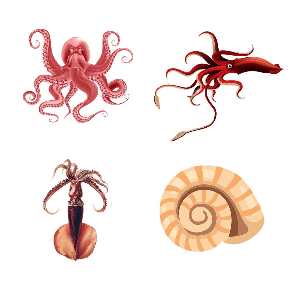
A cephalopod is any exclusively marine animal that belongs to the molluscan class Cephalopoda. The word translates directly from Greek to mean "head-foot" — a reference to how the creature's limbs sprout directly from its head.
The naming draws from nature's most intelligent invertebrates — octopuses, squids, cuttlefish, and nautiluses — creatures whose characteristics map directly onto what a conversational AI should be.
Intelligent
Deep knowledge, surfaced simply. Never overwhelming, always relevant.
Adaptive
Learns context, remembers preferences, evolves with use — like chromatophores changing color.
Approachable
Warm tone, human rhythm. Technology that feels like a natural conversation.
Logo Exploration & Final Mark
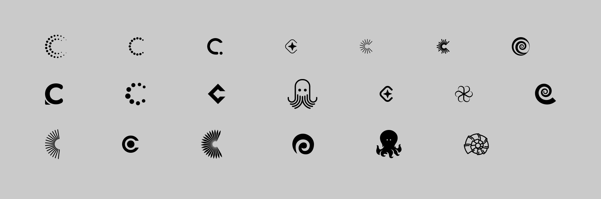
Explored dozens of directions — literal octopus forms, abstract spirals, nautilus shells, geometric "C" lettermarks, dotted patterns, and radial bursts.
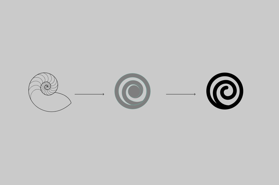
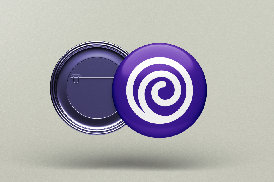
The final mark is inspired by the Nautilus — the most ancient cephalopod, whose shell forms a perfect logarithmic spiral. It represents continuous growth and timeless intelligence.
The spiral enclosed in a circle echoes the nautilus shell's chambered structure — each chamber building on the last, like an AI accumulating knowledge over time.
Motion & Animation
Motion is core to the Cephalopod brand. The spiral mark rotates continuously in digital contexts — symbolizing the always-on, ever-learning nature of the AI. Decorative elements drift and rotate at different speeds, creating an organic, living atmosphere that mirrors how the product adapts to each user.
All animations are intentionally slow and subtle — never distracting, always atmospheric.

Built for Every Surface
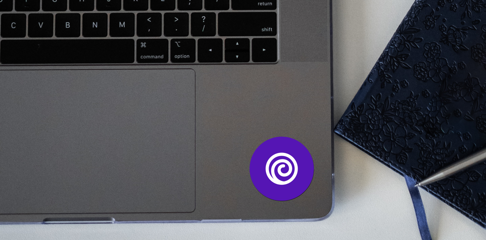
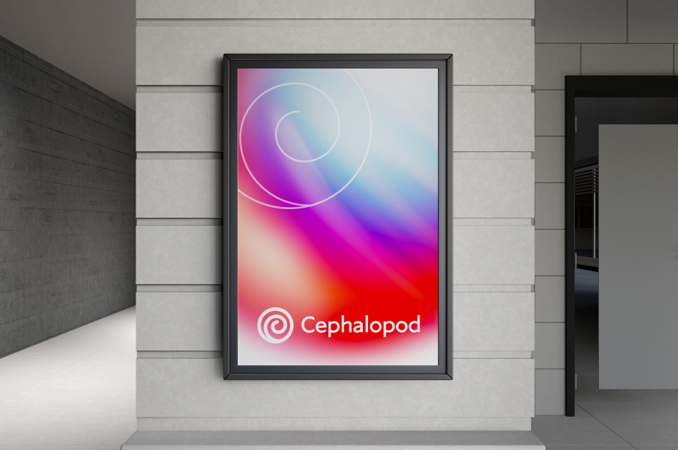
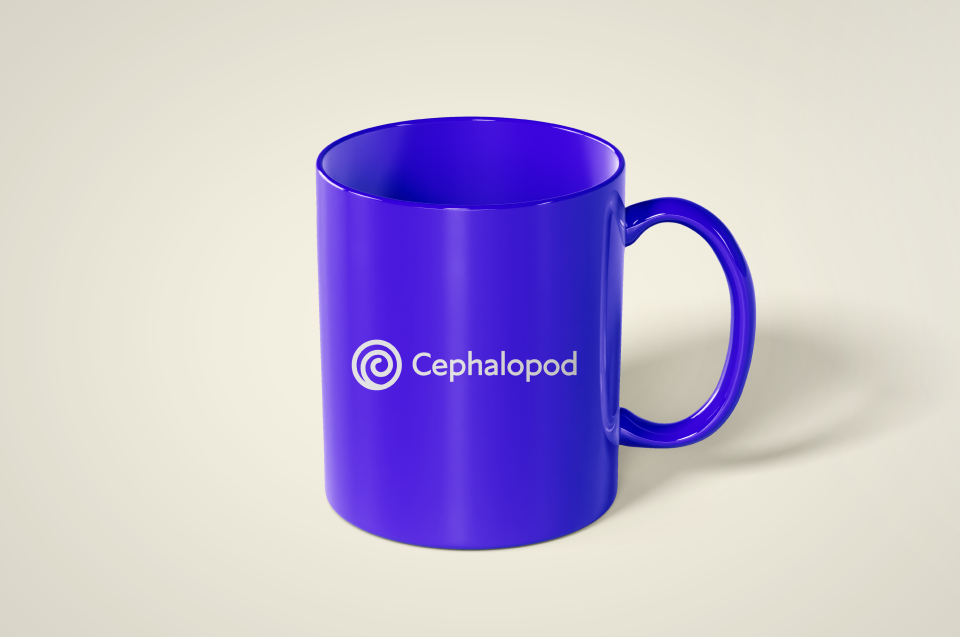
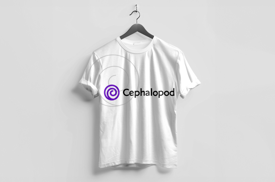
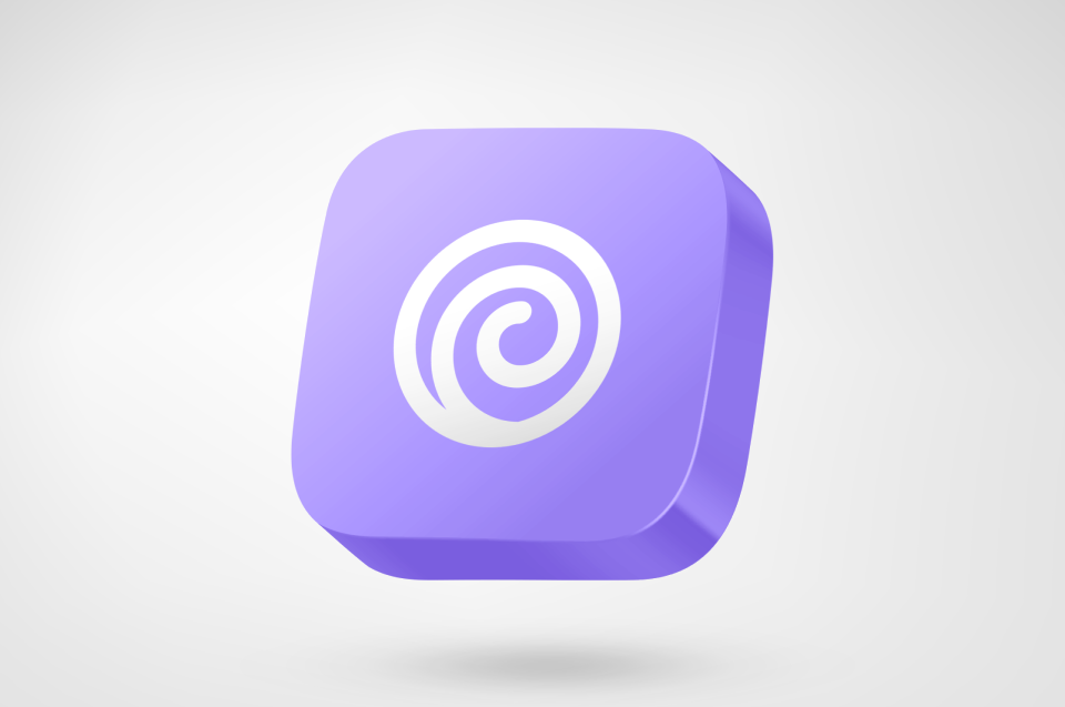
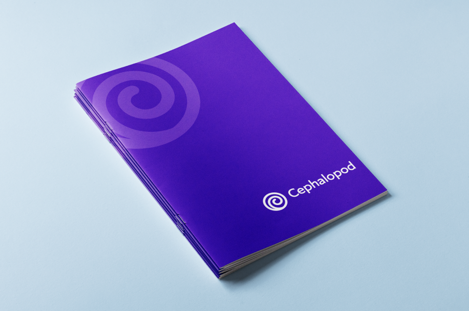
The Cephalopod identity is designed to live anywhere — from digital screens to physical materials. Whether it's a mobile app icon, presentation deck, merchandise, or signage, the mark holds its clarity and impact at any scale.
The simplicity of the spiral ensures it works in single-color, reversed, or full-color applications — making it effortlessly adaptable across any medium or context.
Let's Connect
Have a project in mind or just want to say hi? Feel free to reach out!